
CLIENT
ATS Premier Interiors
Blending timeless sophistication with modern design, ATS Premier Interiors redefines excellence in construction.
ATS Premier Interiors are a well established company and since 1989 they have been providing leading international main contracting and sub-contracting services for hospitality, commercial and residential properties.
Debbie and Russell, the founders of ATS wanted a change up; a brand that could be pushed into the future, timeless and one that could stay relevant for many years to come.
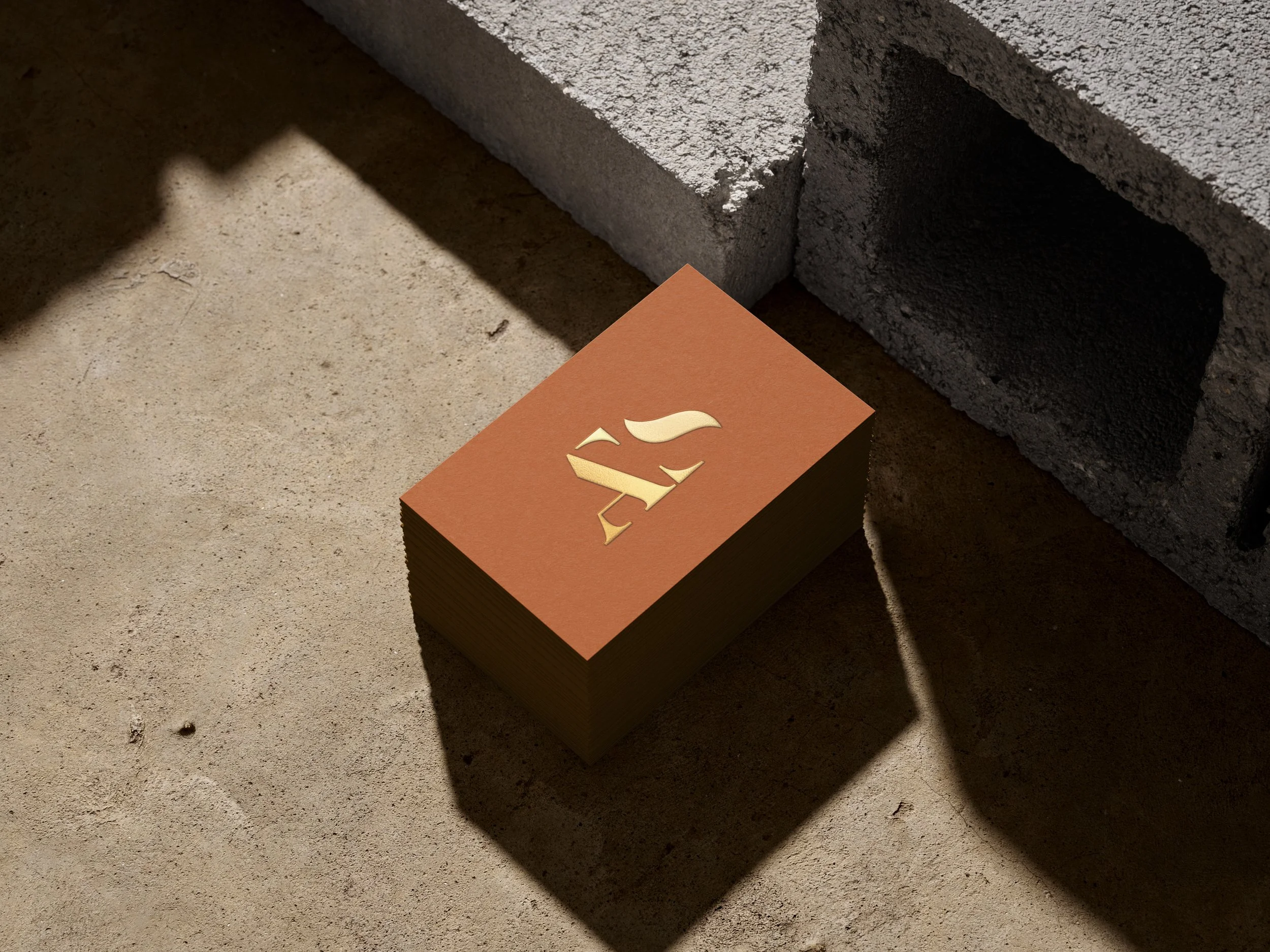
PRIMARY LOGO
BRANDMARK
SECONDARY LOGO
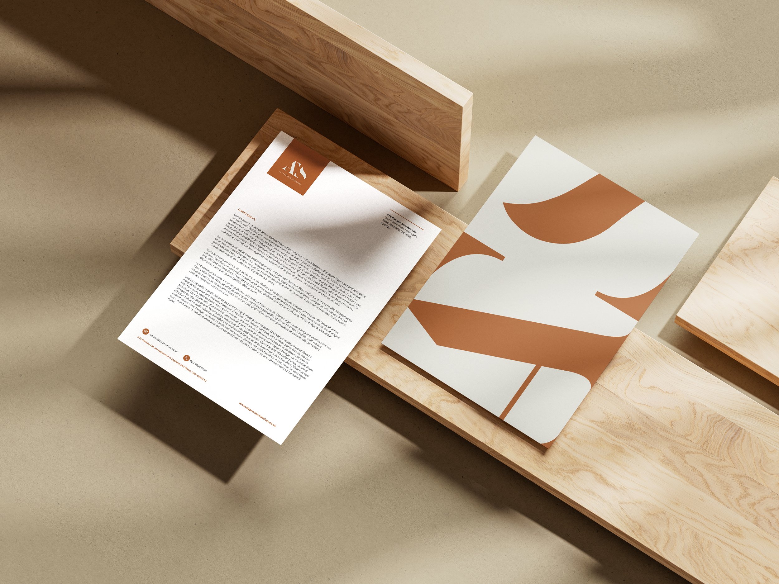
With the success of their impeccable projects, ATS were increasingly winning projects for high-end clients and this was an element I wanted to attach the new branding to. Scrapping the logo to re-create a sophisticated, classic yet modern emblem to be noticed across the industry. This allowed ATS to move away from the typical construction brand style of thick, bold, blues and greens and stand out from their competitors. The palette would be the compliment to this style by incorporating a rust tone to give that subtle pop of colour but injecting stone and granite tones for a stripped back approach, taking influences from the day-to-day materials used in construction.
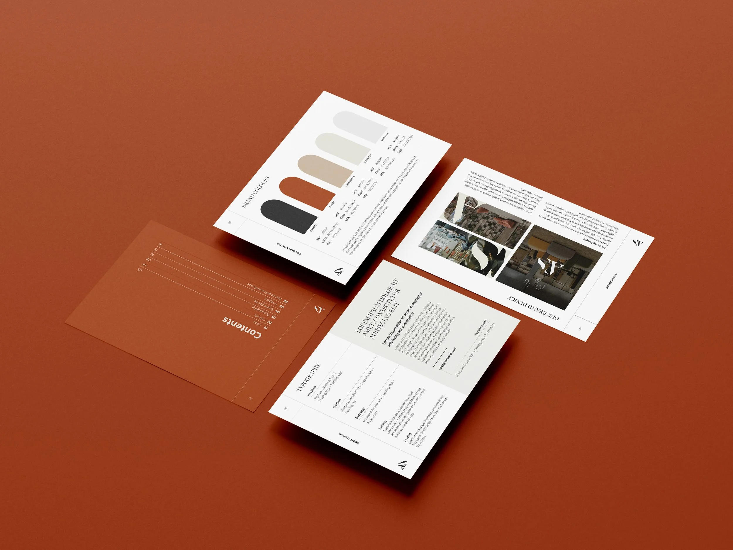
VISUAL IDENTITY
The digital experience for ATS Premier Interiors was designed to present their portfolio in a contemporary and luxurious way. The website takes on a gallery-like approach, placing imagery at the forefront to highlight the craftsmanship and detail of their projects. Subtle branding elements were applied throughout, ensuring a refined balance between visual storytelling and brand presence. The result is a sleek, immersive platform that captures the essence of ATS Premier Interiors’ work while maintaining a timeless, understated aesthetic.
DIGITAL EXPERIENCE

